
Tuesday, 14 December 2010

Monday, 13 December 2010
filming
I filmed in the green room on Wednesday 8Th December. For this section of filming i used the lead male role and the lead female role.
Both roles had to appear in a posh manner. I originally in my story board wanted the pair to dance. However due to the inexperience of the male character, and my limited knowledge of dance, i found this hard to construct.
Instead i used different angles and closeup/medium shots to show the pair gazing at each other.
Outfits
I wanted this section to appear like a traditional sequence. By this i mean a male dominating appearance and a female dismissive role. I think this matched the genre of the song. There for the male character was dressed in a traditional white shirt and trousers. I wanted it to just be a shirt and trousers as it thought the white shirt contrasted well with the female characters outfit.
For the female character I dressed her in a leotard and tights with a maroon scarf. This choice of outfit was because it was what she wore for the other dance sequence which worked well with the lighting. Also a leotard is known as the most commonly used outfit associated with ballet type traditional dance.
Both roles had to appear in a posh manner. I originally in my story board wanted the pair to dance. However due to the inexperience of the male character, and my limited knowledge of dance, i found this hard to construct.
Instead i used different angles and closeup/medium shots to show the pair gazing at each other.
Outfits
I wanted this section to appear like a traditional sequence. By this i mean a male dominating appearance and a female dismissive role. I think this matched the genre of the song. There for the male character was dressed in a traditional white shirt and trousers. I wanted it to just be a shirt and trousers as it thought the white shirt contrasted well with the female characters outfit.
For the female character I dressed her in a leotard and tights with a maroon scarf. This choice of outfit was because it was what she wore for the other dance sequence which worked well with the lighting. Also a leotard is known as the most commonly used outfit associated with ballet type traditional dance.
Tuesday, 7 December 2010
The cd template
My CD templates

This is my first attempt. I wanted a pattern similar to the front cover. However the pattern i think is to harsh for the type of genre. And i also dont like the background colour.

Here is my second attempt, i had a go at moving around the pattern to a different position, i changed the background colour however I'm not sure on this. I also made the pattern appear softer.

Here i looked at different positions. I experimented with the colours on the pattern aswel. I dont think the brown works very well. I think this doesnt give off the genre i wanted.


I experimented with different colours again however i dont like this cover as the colours dont match the type of colours i am looking for.


Here is my final attempt i have changed the background colour to the colour i first used as i think this colour suites the genre and theme more. The pattern is more soft appearing and light. I have also re arranged the pattern to the bottom right.
Monday, 6 December 2010
filming
i had booked a camera for last wednesday (1st of December)
due to the weather conditions and college closing i have had to re schedule this for the upcoming wednesday (8th of December)
The closure of colege has ment that i am a week behind what i planned. therefor i will ave to work faster to shoot the remining shots for my video
the shots i was planning to do on wedesday was the ball room type shots with Matty and Jess.
There is one more location i need to do and that is located at my house, i thereofr will ave to drive there as it is an hour walk. If the weather does not improve i wont be able to do this so i will have to come up with another location or shoot more of another location.
due to the weather conditions and college closing i have had to re schedule this for the upcoming wednesday (8th of December)
The closure of colege has ment that i am a week behind what i planned. therefor i will ave to work faster to shoot the remining shots for my video
the shots i was planning to do on wedesday was the ball room type shots with Matty and Jess.
There is one more location i need to do and that is located at my house, i thereofr will ave to drive there as it is an hour walk. If the weather does not improve i wont be able to do this so i will have to come up with another location or shoot more of another location.
Tuesday, 30 November 2010
digi pack cd cover

This is a picture of a 3D digipack for a CD cover


This is the first attempt, it is plain because i wanted to try a rough draft of were the lettering and picture would go.
I will change the font on my next attempt and adjust the colouring of the picture as i don't think it fits in with the other pictures i will be using.

This is my second attempt. I changed the font of "Jamilla" as to define this as her name and "Hello" as a title.
I think this works better however i think the colour is to plain.

Here in my 3rd try i have changed the brightness and contrast of the photo out. I hav also made the olours less birght and vibrant. However i am not pleased with the result. I think the artist looks to bland and the colours do not match the theme i am going for.
 I used different lettering and a different size, I also experimented using the lettering in a different place. I took this from the Rihanna "loud" album, as she uses a wide spread position of the lettering.
Here i experimented using different words. I also re positioned the picture
However i think there is to much words on here for a cd cover. I also think that the background is to plain.

Here i have changed the positioning of the words and the colour. I think the cvolour balck matches the picture of jess better than the white did.

Here i changed the tone of the picture and also added a pattern. I like this image as it isnt to plain and i am happy with were the title and picture is placed. I think the swirl pattern represents my genre.
choosing name/font style & lettering
I need a name that will suite the artists role.


I have decided to use Jamilla as i think that this name will suite the artists face more.
I researched unusual names as to ensure that my artist stands out
the names are:
Aliyaah
Sadie
Calesha
Shantel
Raven
Jamilla
Precious
Kiara
I have then narrowed it down to a few names using different fonts

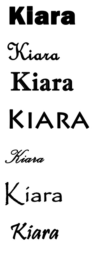
I have decided to use Jamilla as i think that this name will suite the artists face more.
Thursday, 25 November 2010
test shots for cd cover
These shots are taken from my music video that i have print screened. this will ensure that the theme of my digi-pack will fit with the genre of my music video 
I will be using this shot as it has good composition and there is a good colour contrast between the artist and the back wall. I do not think that this picture will work well on the CD cover however as it does not connect with the audience. I think this picture will work well on the poster selling the album in a magazine.
 I also think that this picture works well as it is placed on the left hand side therefore it leaves room for a possible track listings on the right hand side. I am going to try and use this for the back of my CD cover.
 This shot is a medium close up. I think that this shot will be good for the front cover of my digi pack as Jess is looking at the audience and it is a medium shot. also there is room to add the title of the album and name of artist
 I print screened this shot to experiment with the cover however I don't think that it will work very well on my CD pack

I am also going to try and use this picture either on my CD front cover or magazine poster. This shot is iconic as it has the light streaming in from the right hand side. However I don't know if it will work well on my CD cover as it doesn't connect with the audience.
 I think this shot will work well with the front cover of my digi-pack as it is a symmetrical picture and although it doesn't immediately connect with the audience it looks affective.
I will be using this shot as it has good composition and there is a good colour contrast between the artist and the back wall. I do not think that this picture will work well on the CD cover however as it does not connect with the audience. I think this picture will work well on the poster selling the album in a magazine.
 I also think that this picture works well as it is placed on the left hand side therefore it leaves room for a possible track listings on the right hand side. I am going to try and use this for the back of my CD cover.
 This shot is a medium close up. I think that this shot will be good for the front cover of my digi pack as Jess is looking at the audience and it is a medium shot. also there is room to add the title of the album and name of artist
 I print screened this shot to experiment with the cover however I don't think that it will work very well on my CD pack
I am also going to try and use this picture either on my CD front cover or magazine poster. This shot is iconic as it has the light streaming in from the right hand side. However I don't know if it will work well on my CD cover as it doesn't connect with the audience.
 I think this shot will work well with the front cover of my digi-pack as it is a symmetrical picture and although it doesn't immediately connect with the audience it looks affective.
Subscribe to:
Posts (Atom)