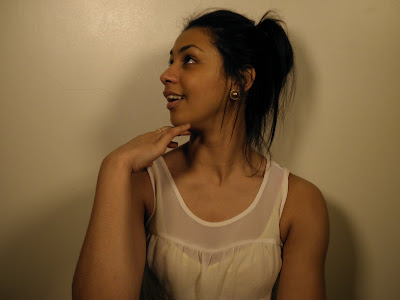
- Experimental stage
- Classic stage
- Parody stage
I would say that the for my song “Hello” The type of stage is a classical one. This is because the lyrics are based on a traditional cohabiting relationship were the man is the dominant alpha male and the woman is the dismissive female. Also the tune has a classical element almost to it. To ensure my video looks classical i made the clips look sepia or a duller tone as this represents a classical stage. It took me some time to decide on the exact tone i wanted, through adobe premiere editing i was able to do this as clips can be copied and reused a number of times. I also kept the classical theme in my chosen outfits. For example when the artist is dancing she is wearing a black leotard, and the male is wearing a shirt and trousers to replicate ball room dancing. As the song is set in the present day, the outfit for my beach locations are similar to the style of to day of a typical passive female, "girly" scarf’s and cardigans. When deciding these outfits I interviewed a dance teacher at Wyke College to identify what would look better on camera and for the particular genre and dance I had chosen. I found that researching this early on ensured i was able to get the best possible look on the resources i had. I choose a dance student to be the main artist as this would fit in well with my genre. http://michaelamarson.blogspot.com/2010/11/dance-interveiw.html The research helped greatly but as you can see from the video there is a lot to putting together a sequence and signifying movements and shots. I therefore encountered some problems whilst filming. Firstly choreographing the dance was a challenge as i am not a dance student myself. I used basic movements as illustrated at the end of the video such as the spins and the arms rising in the air. These are simple ways in which an audience can passively read as a convention of a love song.
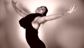
The genre I focused on was a mainstream/rnb genre. The song I have chosen has very much both elements in. It is a moving love song. Therefore I used the codes & conventions of a love video. This includes such conventions as
- Slow motion shots
- Dissolve cuts
- Traditional love locations such as the beach which I have used in Withensea
- Black and white to emphasize a classical view
- Close up’s of a relationship, also the artist.
I have chosen to follow these conventions to ensure my music video looks professional and can be read by the audience. I found the dissolve/ fade shots effective as it is blurring the video into one in a non linear order which captures the audiences attention. The way it does this is by cutting from long shot to medium to close up and fading is using a range of techniques and i was able to use a fast section nearing the end of the song. This grabs attention as you have to concentrate on the shot as the length is short. When using adobe premiere editing i found it an advantage being able to reuse clips and experiment with different sequences as i was able to put together the best possible sequence. The fades and dissolves also fit well with the slow motion technique and the beat of the song. Slow motion captures the moment and creates an emotional response in relation to the song. I found my dance sequence that the artist does with the spins echo's a love feel as she is so happy she is expressing her love through dance. Also it adds a interesting element and shots.
Industries use genre to sell products to audiences. Genre is recognised by audiences through codes and conventions. Rick Attom argues that media offers a set of "pleasures" to an audience,
- emotional pleasure
- visceral pleasure -gut responses
- intellectual pleasure - puzzles, murder investigations, thrillers
The strengths of making full use of genre and conventions in your music video is that the audience can relate and understand it. Making the video more like able. I have therefore attempted to follow recognisable features of the codes and conventions of romance.
For my video the genre of mainstream/R and B is an emotional pleasure as the song conveys a touching relationship. The normal conventions of a r and b video are that they show off wealth. Through fancy cars and designer clothes, men are usually seen as dominant and females as passive. However the song I have chosen is more of a mainstream song still in the r and b category. This consists more of a traditional love genre, therefore men are still seen as the dominant character and females passive. The genre of the song “Hello” is a romantic love song aimed at females around the ages of 15-25. The typical conventions of this genre in a music video would be slow fading shots of artist and couple. Plenty of close-ups and slow motion. These type of shots communicate to an audience a soft loving romance as the fade is floating from scene to scene. A convention would usually be a narrative within the video. My video follows majority of these conventions. Firstly my music video uses a variety of shots jump cutting to various locations to show non continuity.
As my video is in non linear it enables the audience to enjoy a montage of shots from the video which they can interpret in their own way, therefore it is an active response. This is a convention of a music video. I have also used plenty of close up, medium and long shots to allow my artist to be viewed from many angles, ensuring the audience can feel every emotion of the song through different shots means the audience can connect without getting bored. Furthermore the colours of the video are a sepia tone which gives the effect of reminiscing as a couple. Other than when my artist is singing in which case the colours are seen more. the sepia tone allows for an old fashioned feel and the colour of the artist singing is to break up the couple reminiscing. I have also used a hand held camera at some points in the beach shots. This was deliberate as it gives the feel of a reality love home video, If the camera was static the shot would look like all the others so it also breaks up the video to make it look more interesting and give the feel of a love narrative. Also when in slow motion the mood is captured as every movement can be seen slowly.
For my other 2 ancillaries i also used the same colour scheme and conventions such as title and font that matched a classical genre. It is important for me to match the fonts and colours so the theme and genre runs throughout. i choose to use pictures that were taken to replicate the music video in order to construct my digipack as this would show a direct link. I main convention of a digipack and poster is also to have close ups of the artist as it is the artist the audience are buying into. Therefore my front cover is a close up of the artists face and it is also from a side, this is because this is how my video starts. I also like the lighting as it is as if the person has 'seen the light' which is a classical slow song element.
For my music video the style is set in the present day. Therefore the outfit for my beach locations are similar to the style of to day of a typical passive female, "girly" scarf’s and cardigans. For the dance sequence the artist wears a black leotard, as the dance sequence is very traditional and will be similar to the style of ballet. Also The male character will be wearing a suite for the dance sequences as this will appear traditional and smart. When deciding these outfits I interviewed a dance teacher at Wyke College to identify what would look better on camera and for the particular genre and dance I had chosen as i have already stated above. I found the dance
For the ancillary texts I chose to constr
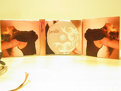
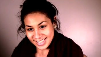 uct a CD Digital pack and a magazine advert for my album. In order to allow the theme of my artist in the video to flow with the ancillary texts I print screened shots from my music video to use. I then had to upload them onto a different computer and into photoshop for editing. I managed to make a front cover, however the rest of the pictures I used as a guidance of the type of pictures I would later take on a camera as the quality was poor. This was because they had to be stretched in photoshop as they were different formats. I decided it was best to replicate the photos for a better quality and more realistic picture This picture to the left was taken from my music video and was my original front cover For example the picture on the bottom left was taken from my video. The picture on the bottom right I took on a cam
 era to try and replicate a better quality one from the video.
 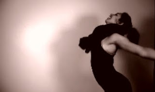 The lighting in the pictures above are the same. I used to Bright lights and faced them on a diagonal in front of the artist to create the glow around her. I found this added to the effect of classical love genre as it can be interpreted as a halo glow. I used the same lighting throughout my video of the shots taken in the green room.
 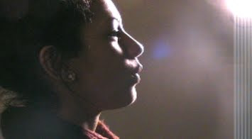 The bright lighting was used on the picture above also, however this time i only used one light and i placed it out of shot but on an angle facing the camera, this meant that i was able to get the light shining in effect and a darker tone to the artist. The light also looks as its coming from above which can also be interpreted as "seeing the light" from above, associated with traditional values such as religion. I then experimented using different colours and techniques for my CD cover. Each side had a different tone to it. After I had finished constructing them I found that the colours didn’t flow as well as id liked. I felt there was no connection from the CD cover to the video. I therefore tried changing the tone of the pictures. I was then unhappy with the quality of my original front cover. I therefore decided to use a different picture taken on my camera and changed the colours of my CD like the picture on th
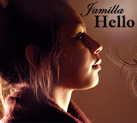 e left. I found this worked better as a combination alongside my music video and the persona of my artist. For my second ancillary I choose a magazine advert of my album. I followed conventional advertisement, for example adding price CD cover and music label. I wanted to follow the same colour scheme as my CD and so chose a low lighted picture with a back light. I fou
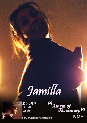 nd the back lighting effective and eye catching. I also felt that the lighting related to the very first scene of my video and therefore worked well in promoting the video. At first I had only 1 quote on my advert. I later changed this and added the CD cover, price and a black fade, so the writing could be easily read. I then felt this looked more like an advert that would appear in a magazine. I believe both my ancillary texts are related to my music video. Particularly through the colour scheme used throughout and the same use of fonts which I believe give a classical effect like the genre of my song and artist. Also the outfits are the same on the ancillary text as the ones in the video of the artist dancing.
 When constructing my audience feedback I wanted it to be an unbiased opinion. I therefore choose to distribute my questionnaires to a class of AS media students consisting of 20 people. The results are objective as i wasn't in the room and the participants were unaware of the director. The audience was also crucial as this was my main target audience. My questions were:
1) Can you recognise the genre of my music video?
2) What indicates to you this is this genre?
3)Do you think I used enough variety of camera shots?
4)Were the actors convincing in their role?
5)How well do you feel my music video captured the meaning of the song?
6)How interesting did you find the duration of the video?
7)How effective was the sound of music matched with the actors performance?
8) How effective were my framing of shots?
9) Would you consider watching this again?
10) What would you suggest to improve my music video?
100% of the people asked recognised that the genre was a mixture of pop and r and b genre, through the codes and conventions of my video. When asked what indicates this genre the comments were the fact that my music videos based on a couple and the sepia tones. 100% of people also agreed i used a variety of camera shots, i had a range of different locations and at different angles, i think this portrays the conventions of a typical music video. Question 4 had a more mixed response. when asked weather my actors were convincing in their role 70% agreed yes they were, 30% ticked sometimes. I believe this is down to the inexperience of me as a director and the actors used. However i also think that when the actors break role and laugh this gives a desirable affect as it looks romantic as the couple enjoy each others company. For question 5, I asked for a rating of 1-5 5 being the best on the quality of meaning my direction brought to the song. 25% voted 3 on the likert scale. This is a positive as no rating was lower than this therefore my music video reached an average. 65% voted 4 and 10% voted 5. I have interpreted this as the meaning of my song was above average however given more time and equipment i could have proceeded to make this a higher score. If i was able to gain access to professional actors/dancers Question 6 i wanted to know if the audience found my music video interesting to watch. I wanted to know this from an objective view as if it was being released. the results were that only 5% voted not very interesting, this could be down to the genre of the music video. It is romantic and therefore stereotypically a girly genre, the class ratio is mostly girls than boys. Also this could be down to genre taste, my music video is a mainstream song which takes up a big percentage of taste however there is still a small percentage that may not enjoy the song. 55% voted slightly interesting and 40% voted yes very interesting. the 40% that voted yes very interesting was an achievement for me to take on board back from my audience feedback as this is a big proportion. However i also have to take into account the 55% that voted slightly interesting. I believe that i could have produced more of a narrative within my music video that mabey could have helped with the interesting side of my video. question 7 was to analyse the sound match with my choice of artist. When choosing the artist i wanted to ensure that her performance would match the sound of the song. As my chosen song was a beyonce song i found this difficult to find. I feel that the chosen artist works well in the mime, and that i have matched up the singing well. the results from this question were 20% rated 3 50% rated 4 and 30% rated 5. 5 was the highest rating. I therefore think that having 30% agree it was the highest possible shows that my choice of actors fits well. For question 8 i asked how effective were my framing of shots. 20% voted 3 35% voted 4 and 40% voted 5. I have interpreted this as some of my shots are effective however there are some shots i could have taken more care with. I think the very first shot is effective in the lighting and the angle of the side of the face. However i think that some of the shots are to much of medium shots. Also the framing is mostly straight on in the green room. therefore this may have being perceived as not very effective. I did try to balance this out by using hand held shots on the beach and panning around my artists. When taking into acount these statistics i added a qualitative question at the end (question 10) this was to ask ehat they would improve. The main responces i gained back from this were to use a more wider variety of background settings, to not have as much laughter in the video, to use more actors, and more angle shots. I have taken these comments into account as i could have used different settings other than the beach. My choice for the beach was to ensure the audience could relate to a stereotypical romantic setting. Overall 70% of the people asked in my audeince feedback said they would watch my video again. i beluieve this is ahigh percentage given that this is the first music video i have produced.4) how did you use new media technologies in the construction and research planning and evaluation
Media technologies played a huge part in the planning research and construction of my music video and ancillary texts. To start i used http://www.blogger.com/ to track my progress and build up a file. blogger has many advantages
easily accessible to anywere with an internet connection- adaptable to technologies and file formats
- more practical than a paper file
- more visual and understandable in a postmodern lesson
These points have helped me to construct my video.
Secondly i used the internet to research all of my music videos and ancillary texts. I was able to veiw music videos on youtube and use google to analyse images. Also another main advantage with the internet is that it works well with blogger as i can upload the pictures and add text by the side. The internet is full of up to date information by the second. This also came as an advantage.
Youtube as i hav already mentioned i used to analyse many music videos and figure out codes and conventiosn to use or challange in my video. Also youtube can be revisited as blogger can from any computer that has internet access therefore it is also easily accessable. i found youtube a helpful tool when researching.
I used a digital camera provided by the college to take my pictures. The camera was more useful than my own as the quality was higher. The pictures i then felt looked more proffesional. I used photoshop to edit my pictures, this enabled me to use tools such as brightness and contrast. I lso used different texts, fonts and combined images. This allowed the image to look more proffessional and follow conventional codes. I also made use of the layers when producing drafts and trying different styles. The ohotoshop format is also flexible as you can save it as a JPEGG which can then be uploaded to blogger.
I used a Cannon MD205 to film all my material and a Sony mini DV tape to transfer my material onto the diting suite (Adobe premiere pro) the camera was digital and easy to use. It was also small so easy to carry about. I also used a tripod to frame most of my shots.
Premiere adobe editing suite was hard to start using but once i had learnt the basics i found it easier toexperioment with my shots. The main advantage of using this was that i was able to experiment with any clip and reuse the origional copy. i was also able to put more sequences one so to back up the video incase i changed something that didnt fit.


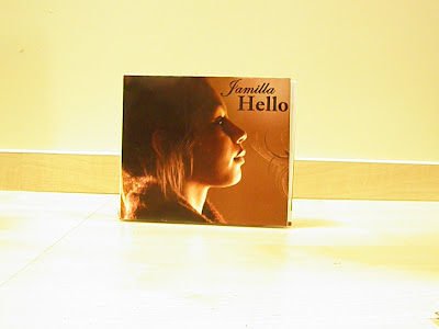



 Here is my back cover. Again i have changed the colours to match the rest of my album. I think that the colours matching creates a warmer album. I have however used a film grain effect on the back cover to draw attention to the tracks and not just the picture.


