This is the first full edit, i would still like to keep trying out different arrangements.
Friday 17 December 2010
Tuesday 14 December 2010

Monday 13 December 2010
filming
I filmed in the green room on Wednesday 8Th December. For this section of filming i used the lead male role and the lead female role.
Both roles had to appear in a posh manner. I originally in my story board wanted the pair to dance. However due to the inexperience of the male character, and my limited knowledge of dance, i found this hard to construct.
Instead i used different angles and closeup/medium shots to show the pair gazing at each other.
Outfits
I wanted this section to appear like a traditional sequence. By this i mean a male dominating appearance and a female dismissive role. I think this matched the genre of the song. There for the male character was dressed in a traditional white shirt and trousers. I wanted it to just be a shirt and trousers as it thought the white shirt contrasted well with the female characters outfit.
For the female character I dressed her in a leotard and tights with a maroon scarf. This choice of outfit was because it was what she wore for the other dance sequence which worked well with the lighting. Also a leotard is known as the most commonly used outfit associated with ballet type traditional dance.
Tuesday 7 December 2010
The cd template
My CD templates

This is my first attempt. I wanted a pattern similar to the front cover. However the pattern i think is to harsh for the type of genre. And i also dont like the background colour.

Here is my second attempt, i had a go at moving around the pattern to a different position, i changed the background colour however I'm not sure on this. I also made the pattern appear softer.

Here i looked at different positions. I experimented with the colours on the pattern aswel. I dont think the brown works very well. I think this doesnt give off the genre i wanted.


I experimented with different colours again however i dont like this cover as the colours dont match the type of colours i am looking for.

Here is my final attempt i have changed the background colour to the colour i first used as i think this colour suites the genre and theme more. The pattern is more soft appearing and light. I have also re arranged the pattern to the bottom right.
Monday 6 December 2010
filming
i had booked a camera for last wednesday (1st of December)
due to the weather conditions and college closing i have had to re schedule this for the upcoming wednesday (8th of December)
The closure of colege has ment that i am a week behind what i planned. therefor i will ave to work faster to shoot the remining shots for my video
the shots i was planning to do on wedesday was the ball room type shots with Matty and Jess.
There is one more location i need to do and that is located at my house, i thereofr will ave to drive there as it is an hour walk. If the weather does not improve i wont be able to do this so i will have to come up with another location or shoot more of another location.
Tuesday 30 November 2010
digi pack cd cover

This is a picture of a 3D digipack for a CD cover


This is the first attempt, it is plain because i wanted to try a rough draft of were the lettering and picture would go.
I will change the font on my next attempt and adjust the colouring of the picture as i don't think it fits in with the other pictures i will be using.

This is my second attempt. I changed the font of "Jamilla" as to define this as her name and "Hello" as a title.
I think this works better however i think the colour is to plain.

Here in my 3rd try i have changed the brightness and contrast of the photo out. I hav also made the olours less birght and vibrant. However i am not pleased with the result. I think the artist looks to bland and the colours do not match the theme i am going for.
 I used different lettering and a different size, I also experimented using the lettering in a different place. I took this from the Rihanna "loud" album, as she uses a wide spread position of the lettering.
Here i experimented using different words. I also re positioned the picture
However i think there is to much words on here for a cd cover. I also think that the background is to plain.

Here i have changed the positioning of the words and the colour. I think the cvolour balck matches the picture of jess better than the white did.

Here i changed the tone of the picture and also added a pattern. I like this image as it isnt to plain and i am happy with were the title and picture is placed. I think the swirl pattern represents my genre.
choosing name/font style & lettering
I need a name that will suite the artists role.


I have decided to use Jamilla as i think that this name will suite the artists face more.
I researched unusual names as to ensure that my artist stands out
the names are:
Aliyaah
Sadie
Calesha
Shantel
Raven
Jamilla
Precious
Kiara
I have then narrowed it down to a few names using different fonts

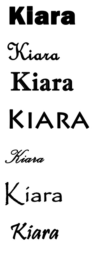
I have decided to use Jamilla as i think that this name will suite the artists face more.
Thursday 25 November 2010
test shots for cd cover
These shots are taken from my music video that i have print screened. this will ensure that the theme of my digi-pack will fit with the genre of my music video 
I will be using this shot as it has good composition and there is a good colour contrast between the artist and the back wall. I do not think that this picture will work well on the CD cover however as it does not connect with the audience. I think this picture will work well on the poster selling the album in a magazine.
 I also think that this picture works well as it is placed on the left hand side therefore it leaves room for a possible track listings on the right hand side. I am going to try and use this for the back of my CD cover.
 This shot is a medium close up. I think that this shot will be good for the front cover of my digi pack as Jess is looking at the audience and it is a medium shot. also there is room to add the title of the album and name of artist
 I print screened this shot to experiment with the cover however I don't think that it will work very well on my CD pack

I am also going to try and use this picture either on my CD front cover or magazine poster. This shot is iconic as it has the light streaming in from the right hand side. However I don't know if it will work well on my CD cover as it doesn't connect with the audience.
 I think this shot will work well with the front cover of my digi-pack as it is a symmetrical picture and although it doesn't immediately connect with the audience it looks affective.
I will be using this shot as it has good composition and there is a good colour contrast between the artist and the back wall. I do not think that this picture will work well on the CD cover however as it does not connect with the audience. I think this picture will work well on the poster selling the album in a magazine.
 I also think that this picture works well as it is placed on the left hand side therefore it leaves room for a possible track listings on the right hand side. I am going to try and use this for the back of my CD cover.
 This shot is a medium close up. I think that this shot will be good for the front cover of my digi pack as Jess is looking at the audience and it is a medium shot. also there is room to add the title of the album and name of artist
 I print screened this shot to experiment with the cover however I don't think that it will work very well on my CD pack
I am also going to try and use this picture either on my CD front cover or magazine poster. This shot is iconic as it has the light streaming in from the right hand side. However I don't know if it will work well on my CD cover as it doesn't connect with the audience.
 I think this shot will work well with the front cover of my digi-pack as it is a symmetrical picture and although it doesn't immediately connect with the audience it looks affective.
Monday 22 November 2010
analysis of cd covers
i have chosen to analyse these 3 CD covers as they represent the genre of my song and artist.
Rhianna - loud

This album cover is an extreme close up of the artists face. extreme close ups are common on album covers as it shows the artist the audience is buying and becomes personal. the colour has been tainted red this is to add to the colour.
Genre
The mise en scene of the image is an extreme close up of the artists face and hair. This is similar to the picture above because many CD covers conventionally have an extreme close up of the artists face. There is colour on the cover however it has been toned down and the overall colour is a caramel brown look. This matches with Leona's hair. Leona's hair is wavy and natural, I interpreted this as a link to the title spirit, that nobody can identify a spirit it is something natural. Also the green eye shadow that Leona is wearing is a colour related to nature e.g grass. this will be a link to the title "spirit" The background is dark, this could be emphasizing the darkness and unknown of "spirits".
LETTERING/FONT SIZES AND STYLING:
The words used are the artists name "Leona Lewis" and the title of the album "Spirit" The artists name doesn't always have to exist. The font style is small lettering and it isn't bold, This will be because the album "spirit" isn't a bold title. The artists name is placed at the top whilst the name of the album is below this helps frame the image & draw attention to Leona's face. Th colours are different, the name is in white and the title is in a light yellow. This is because the title needs to stand out against Leona's neck and the name of Leona needs to standout against the black, and yellow again is a colour related with nature, e.g the sun.
Beyonce - Halo
Rhianna - loud
Leona Lewis - spirit
Beyonce - Halo
This album cover is an extreme close up of the artists face. extreme close ups are common on album covers as it shows the artist the audience is buying and becomes personal. the colour has been tainted red this is to add to the colour.
Genre
the genre of the front cover has to match the codes and conventions of a normal CD cover, whilst also adapting to the genre of the type of music the artist produces. You also have to consider the information's you put onto the digipack, for example the title of the album, album track list. The genre of Rhianna's album cover is a vintage type with a modern twist. The cover is a statement of "LOUD" and this comes across in the genre. The bright red lipstick and hair is a deliberate statement.
Chosen image
the mise-en-scene of the CD cover it is important to take all aspects into account. For example the chosen picture, type of shot, colouring, props, lighting and choice of style. For Rhianna the colour is a taint of red overall this suggests a vintage style for example the red lipstick was a popular connotation for sex. The colour of Rhianna's lips also match the colour of the hair & the tint of the overall cover, This brings a warm feel to the cover. Rhianna's hair is a shocking red colour, this emphasizes the "Loud" title as the colour stands out. Also the colour red on a persons hair is the most dominant colour in terms of hair dye, this is a statement of dominance. The image is an extreme close up which allows the audience to connect with the artist more. Rhianna has her eyes closed, this was a deliberate choice. I interpreted this as a picture that breaks conventions and allows the reader to be intrigued as to what the album contains. Rhianna's face is also serious to show that she is a serious artist.
LETTERING/FONT SIZES AND STYLING:
The lettering font size and style is crucial in promoting the album cover. It must represent the chosen genre and artist. For Rhianna's album the title is "loud" therefore the font has been spread out between the bottom cover, this could be interpreted as being loud as it is taking up more room. The title font size is much shorter than the overall album cover. It also isn't bold which doesn't represent a "loud" connotation. However i interpret this as Rhianna wants to appear louder and more vibrant then the title itself, appearing "loud" The artists name "Rhianna" hasn't been used, I believe this was deliberate to show that she is loud enough to be known without her name written.
Leona Lewis - Spirit

The second CD cover i have chosen to analyse is Leona Lewis "Spirit"
genre
The genre of this cover is tame and mainstream. I have interpreted this through a variety of different elements. Firstly the colour scheme is low key and the facial expression is serious. compared to the picture above (Rhianna's) the colours and way the photo is position have a dramatic effect on how is is perceived.
The mise en scene of the image is an extreme close up of the artists face and hair. This is similar to the picture above because many CD covers conventionally have an extreme close up of the artists face. There is colour on the cover however it has been toned down and the overall colour is a caramel brown look. This matches with Leona's hair. Leona's hair is wavy and natural, I interpreted this as a link to the title spirit, that nobody can identify a spirit it is something natural. Also the green eye shadow that Leona is wearing is a colour related to nature e.g grass. this will be a link to the title "spirit" The background is dark, this could be emphasizing the darkness and unknown of "spirits".
LETTERING/FONT SIZES AND STYLING:
The words used are the artists name "Leona Lewis" and the title of the album "Spirit" The artists name doesn't always have to exist. The font style is small lettering and it isn't bold, This will be because the album "spirit" isn't a bold title. The artists name is placed at the top whilst the name of the album is below this helps frame the image & draw attention to Leona's face. Th colours are different, the name is in white and the title is in a light yellow. This is because the title needs to stand out against Leona's neck and the name of Leona needs to standout against the black, and yellow again is a colour related with nature, e.g the sun.
Beyonce - Halo

Genre
The genre for Beyonce's CD cover is again a timid mainstream album. Its target market is clearly young girls. This you can see from beyonce's girl like tendency's on the album cover.
Chosen Image
Th chosen image along with the rest of the mise-en-scene is in black and white. Interestingly this album cover is not an extreme close up of the artists face. It is inf act a long shot of beyonce strolling along the beach. This theme echo's the theme of her video "Broken hearted girl" which i have analysed below. this has to be taken into account when choosing a particular genre. The way the artist is standing is in a conventional girl pose with her hands hiding part of her face. the outfit is also silky and dressy. The outfit could be related to an angels outfit relating tot he title "Halo" The artists hair is also pushed back to create a more natural effect. The background of the sea and sand is out of focus, this is to ensure the main focus is Beyonce the artist. Also the background contrasts with Beyonce's hair as to make her stand out.
LETTERING/FONT SIZES AND STYLING:
The font style is different for the artists name and for the title. The name "Beyonce" has been made to be the most dominant out of the two names, as this is the artists name. Int he background the line between the sea and the sky interestingly overlaps the middle of Beyonce's name. I interpreted this as the feel of a Halo across Beyonce's name, relating to the title of the album. The full words are in capital letters, this draws attention tot he, and they are placed along the left hand side of the screen because the main image takes up the right hand side.
Friday 19 November 2010
filming
I have currently filmed the beach shots locations & half of the studio shots.
The beach shots I choose to construct first due to weather conditions. I filmed then towards the end of October & the weather appeared on camera as a mild summer day. With the sun streaming in in a few of the shots. This gives off a good effect on camera. The studio shots were taken yesterday and provide some singing shots and dance sequence shots.
Outfits
The beach scene
Jessica - lead female
The costume i choose for Jessica was a typical female teenage girl look. She wore black leggings and a cream coloured cardigan with a small scarf. The type of outfit suggested that she follows typical female traditional roles of being dismissive as appose to dominant. Jessica wore her hair down and curly. I choose this look as she has naturally curly hair therefore it doesn't look as if she has made massive amounts of effort. Also the track "Hello" has a strong female lead voice, I think that curly hair emphasizes a strong voice.
Matthew - the lead male
I wanted to go for a more casual look with Matthew but also make him look dominant. I choose a pair of jeans with a checked t-shirt and a black V neck jumper over the top. I believe the shirt and jumper made him look smart casual and that he came across as a dominant character
Studio locations
Jessica - lead female
i shot half of the studio shots yesterday of Jess only. The costume that she wore was a leotard and thin black tights. This choice of outfit came from the advice from the dance teacher i interviewed bellow. She advised that traditional ballet costumes are leotards and tights too allow full movement to be shown on performance.
When I began filming with Jess and her leotard I found that the leotard looked to plain for the dance sequence. I therefore added a maroon coloured scarf which allowed a more interesting outfit for the audience to look at. Her hair was pulled back into a bobble. I choose this look as i wanted the dance sequence Jessica performs to look as though she is performing for her own pleasure within the song thinking of her partner, Rather than it look as though she is performing on stage.
The studio was set against a white background, using 2 bright lights either side of Jessica to emphasize the lighting of her face. This also created a black shadow to the left of Jessica which came across as a nice added effect on camera.
Wednesday 17 November 2010
cd digipak research
i have decided to produce a cover for its release as part of a digipack (CD/DVD package)


These covers are all from Beyonce's recent album which is were the song "Hello" is from. Therefore the style is relevant to what the conventions of my video should look like.
All three pictures are in light black and white, this emphasizes the raw emotion in Beyonce's face.
Also Beyonce's expressions on all three are serious and her hair is pushed back to show her full face.
Each one has a significant pose in which the hands and arms are being used in a particular way. For example in the first picture Beyonce is using her hands to pretty her face. & show show the jewelry she has on her hands. One the second picture Beyonce is pushing her hair back to emphasize her face. In the last picture Beyonce appears to have no clothes on & her arms appear to be protecting her body. This shows Beyonce in a vulnerable light. The location is also on the beach which is a stereotypical love scene.

This is the mock up of what a normal digipak would look like.
I am now going to analyse various CD covers from my chosen genre. I will also analyse a few pictures of the artist who sings my chosen song to allow me to focus on the type of pictures i will need to be taking of my actor.


These covers are all from Beyonce's recent album which is were the song "Hello" is from. Therefore the style is relevant to what the conventions of my video should look like.
All three pictures are in light black and white, this emphasizes the raw emotion in Beyonce's face.
Also Beyonce's expressions on all three are serious and her hair is pushed back to show her full face.
Each one has a significant pose in which the hands and arms are being used in a particular way. For example in the first picture Beyonce is using her hands to pretty her face. & show show the jewelry she has on her hands. One the second picture Beyonce is pushing her hair back to emphasize her face. In the last picture Beyonce appears to have no clothes on & her arms appear to be protecting her body. This shows Beyonce in a vulnerable light. The location is also on the beach which is a stereotypical love scene.
my animatic
This is the animatic for my music video "Hello"
I found that making this animatic has helped me plan for my shooting a lot, as i realised on some occasions I missed counting the beat and had to re adjust the video. The photo's are slightly out of focus however this is the over all plan i would like my music video to look like
Wednesday 10 November 2010
dance interveiw
In my music video i would like to add a dance sequence. The person who will be the actor in my video is a dance student & therefore fits this criteria. However i do not know a great deal about the type of dance i would like to add into my video, which is ballet. therefore i asked for professional advice from a current dance teacher at Wyke sixth form college.


Monday 1 November 2010


Subscribe to:
Posts (Atom)